
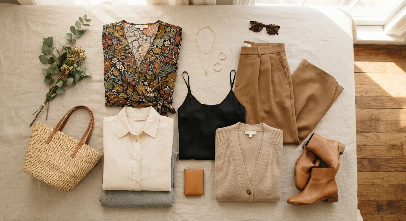
What Each Category Actually Does
Before deciding when to lean on prints, solids, or neutrals, it helps to understand what each one is doing visually and emotionally in an outfit.
| Primary role of prints | Express personality and create visual interest |
| Primary role of solids | Highlight silhouette and support statement elements |
| Primary role of neutrals | Provide compatibility and visual cohesion |
| Common neutral shades | White, cream, beige, tan, gray, navy, black |
| Best occasion for prints | Social, creative, or casual settings |
| Best occasion for solids | Formal, professional, or tailored looks |
| Reliable outfit formula | One statement element + two supporting elements |
Prints draw attention and communicate personality. A bold floral, a geometric repeat, or a classic stripe all signal energy and intention. Prints are inherently conversational - they invite a second look and carry mood on their own, even before fit or accessories enter the picture.
Solids create clarity. A single-color piece asks the eye to focus on shape, silhouette, and fit rather than surface detail. That makes solids especially powerful in tailoring, structured workwear, and minimalist looks where the cut is the point.
Neutrals - which include whites, creams, beiges, grays, tans, navy, and black - function as connective tissue. They can serve as solids, but their real job is compatibility: a neutral piece can sit next to almost anything without creating visual conflict. For a deeper look at how neutrals work hardest in a wardrobe, see why neutrals are so useful and how to use them.
When to Let Each One Lead
The most useful way to think about prints, solids, and neutrals is through the lens of who's doing the work in an outfit. Only one element can logically lead - the rest should support it.
Any repeated or illustrated visual pattern applied to fabric, including florals, stripes, geometrics, and abstract motifs. Prints add visual energy and communicate personality at a glance.
Solid
A garment in a single, uniform color with no pattern or print. Solids emphasize silhouette and cut, making them ideal for showcasing tailoring or supporting statement pieces.
Neutral
Colors that sit outside saturated hues and pair easily with most other shades - typically whites, creams, beiges, tans, grays, navy, and black. Neutrals act as connective tissue in an outfit.
Visual weight
The degree to which a garment or element draws the eye. Prints typically carry high visual weight; neutrals carry low visual weight, making them easier to balance in an outfit.
Capsule wardrobe
A small, intentionally curated collection of versatile pieces that can be mixed and matched across many outfits. Neutrals and solids are often the foundation of a capsule approach.
Let a Print Lead When…
- You want the outfit to express a mood or personality without relying on accessories or layering.
- You're wearing a simple silhouette (a shift dress, a straight-leg trouser) and want the surface to carry interest.
- The occasion is social or creative and allows for self-expression over formality.
When a print leads, pair it with solids or neutrals underneath and alongside. A printed blouse works best with a neutral trouser; a statement-print skirt doesn't need a competing top. For guidance on pairing multiple prints intentionally, see the logic behind successful pattern mixing.
Let a Solid Lead When…
- The silhouette, fabric, or construction is the star - think a perfectly cut blazer or a structured midi skirt.
- You're building an outfit around a statement accessory, shoe, or bag.
- The dress code calls for restraint: interviews, formal events, or polished professional settings.
Solid pieces are also ideal anchors in a mixed outfit - a solid-colored base lets a printed scarf or textured layer stand out clearly. Texture and fabric often do their best work alongside solids, where depth can be felt rather than read.
Let Neutrals Lead When…
- You want effortless outfit cohesion without active styling decisions.
- You're traveling, capsule dressing, or dressing for versatility across multiple occasions.
- The goal is quiet authority - a head-to-toe neutral look reads as confident and intentional when the pieces fit well.
An all-neutral outfit doesn't mean flat or boring. Varying the shades (ivory with camel, gray with charcoal), mixing textures, and playing with proportion keep things visually interesting. If you've ever wondered what a mostly neutral wardrobe really involves in practice, the honest pros and cons of a monochrome wardrobe is worth a read.
Building a Signature Formula
Most people with consistent, recognizable style have an instinctive formula - a default ratio of prints, solids, and neutrals that they return to outfit after outfit. Figuring out yours is less about rules and more about noticing what feels like you.
1 leads, 2 support
Reliable outfit composition rule
A widely used styling principle: one element (print, solid, or neutral) leads visually while the other two pieces play a supporting role.
70-30
Common neutral-to-print ratio in capsule wardrobes
Many wardrobe stylists suggest anchoring a flexible closet with roughly 70% neutrals and solids, leaving 30% for prints and color accents.
A reliable starting framework: one statement, two supports. One element leads (print, bold solid, or interesting neutral texture), and two others support it quietly. This isn't a rigid rule - it's a starting point that prevents the common problem of too many elements competing at once.
Your personality and lifestyle should shape how you weight each category. If you gravitate toward structure and minimalism, solids and neutrals will likely anchor most of your wardrobe. If you're drawn to color and self-expression, prints might lead more often - and learning to mix prints without clashing becomes a genuinely useful skill.
The goal isn't to pick one category and commit to it forever - it's to understand what each one offers so you can reach for the right tool at the right moment. That's what separates getting dressed from developing a style.