
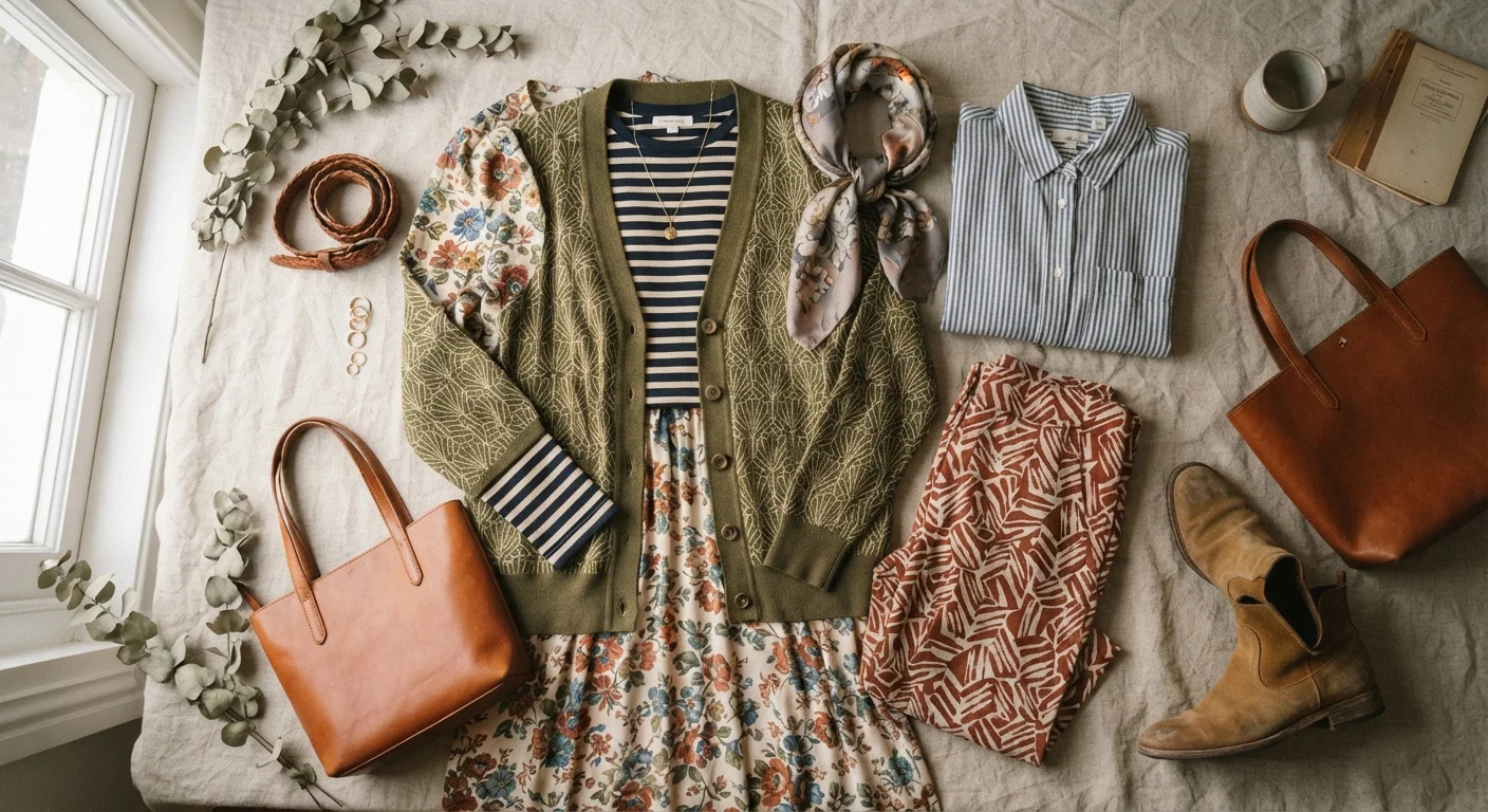
Why Pattern Mixing Looks Effortless on Some People
You've seen it: someone walks in wearing a floral blouse with plaid trousers and it just works. Meanwhile, a similar attempt in your own closet produces something that looks unintentionally jumbled. The difference isn't luck or an innate talent - it's a set of underlying principles that most confident pattern mixers apply intuitively (or have learned to apply deliberately).
Pattern mixing isn't about breaking rules. It's about understanding which visual variables you're controlling and making sure at least two of them align. When an outfit feels chaotic, it's usually because too many variables - scale, color, density, and style of print - are all competing at once. When it feels cohesive, even if boldly so, it's because some variables have been harmonized while others create intentional contrast.
If you've ever wondered why your outfits never feel quite right, unintentional pattern competition is one of the most common culprits.
78%
Shoppers who say personal style matters to their confidence
According to a consumer survey by the Cotton Incorporated Lifestyle Monitor, a large majority of respondents link how they dress to how confident they feel day-to-day.
2-3
Ideal number of patterns in one outfit
Style educators and fashion programs broadly cite two to three as the range where pattern mixing remains readable and intentional for most everyday contexts.
The Scale Principle: Your Most Powerful Tool
Scale contrast is the single most reliable technique in pattern mixing. When two prints are nearly identical in size, they create visual vibration - the eye can't settle on either one. Pairing a large, bold print with a smaller, finer one instantly establishes hierarchy: one pattern leads, the other supports.
Think of a wide windowpane plaid blazer over a fine pin-striped shirt. The blazer commands attention; the shirt adds texture and interest up close without competing. This is the same principle designers use when combining patterns on a runway look - one element dominates, the others enrich.
A useful rule of thumb: aim for at least a 2-to-1 size difference between your primary pattern and any secondary one. If you're working with three patterns, make the scale progression distinct enough that each one occupies a different visual register.
Start with Stripes as Your Base
Narrow stripes behave almost like a neutral in a mixed-pattern outfit because they read as texture rather than print at a distance. Pairing a fine stripe with one bolder, more expressive pattern is one of the most foolproof entry points into pattern mixing - the stripe supports without competing.
Color as the Invisible Connector
The second variable that separates cohesive pattern mixing from visual noise is color. When two very different prints share even one color - especially a dominant one - the eye reads the combination as intentional rather than accidental. That shared hue becomes the invisible thread connecting the outfit.
This doesn't mean both patterns need to be the same color family. A geometric print in navy and ochre paired with a floral in navy and blush works because the navy is a bridge between them. The eye follows the shared tone and interprets the rest as variation on a theme.
Understanding how color pairing works is genuinely foundational to mixing patterns confidently - the logic applies whether you're working with solids or prints.
Tonal mixing - where all patterns share a similar lightness or saturation level - is another approach that works even without a shared hue. An outfit built entirely in warm, muted tones (rust, mustard, terracotta) can carry three different prints and still read as unified because the mood of the colors harmonizes.
The Role of Neutral Anchors and Texture
Even the most considered pattern combination benefits from at least one visual rest point. A solid-color layer, a neutral shoe, or a simple bag gives the eye a moment to pause before re-engaging with the patterns. Without any anchor, even a well-scaled, color-coordinated mix can feel like a lot.
Texture plays a similarly important role that often goes underappreciated. When two patterned pieces have different fabric weights or surface textures - say, a cotton poplin stripe and a nubby wool tweed - the tactile contrast naturally separates them visually and reduces competition. Texture and fabric is the dimension most people overlook in their outfits, but it's particularly useful when layering prints.
For a practical framework on when to let patterns lead versus when to step back, see prints, solids, and neutrals: when to lean on each.
Building Confidence One Combination at a Time
Pattern mixing is a skill built through experimentation, not a talent you either have or don't. The most practical way to develop it is to start with combinations that have a built-in safety net - a striped tee under a printed blazer, for instance - and pay attention to what your eye tells you when you look in the mirror. Does one pattern feel like it's competing? Try swapping one piece for a smaller-scale version. Does the whole thing feel flat? Add a bolder contrast in scale or a brighter shared color.
If you're looking for reliable structures to build from, outfit formulas that actually work can give you repeatable starting points that make it easier to isolate pattern as the one variable you're experimenting with.
The logic behind outfits that shouldn't work but do is consistent: someone made deliberate choices about scale, color, and visual rest. Once you internalize those principles, you stop seeing pattern mixing as a gamble and start seeing it as one of the most expressive tools in your personal style toolkit.