
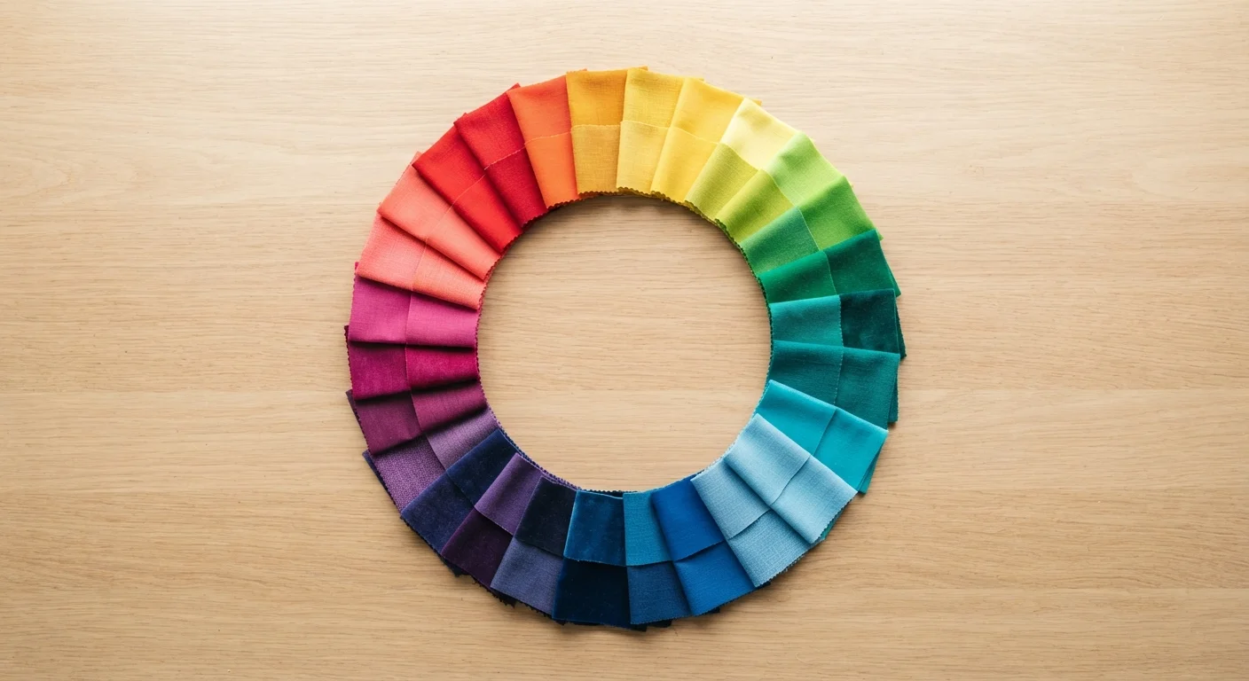
The Color Wheel: Your Wardrobe's Map
The color wheel isn't just a art-class relic - it's genuinely the most useful tool for understanding why certain outfits work. At its core, the wheel organizes 12 colors into three groups: primary (red, yellow, blue), secondary (orange, green, violet - blended from two primaries), and tertiary (the six hues created by mixing adjacent primaries and secondaries). Once you can mentally picture a color wheel, predicting which combinations will look harmonious becomes much more intuitive.
Three color relationships show up again and again in fashion advice:
- Complementary: Colors directly opposite each other on the wheel. High contrast, bold energy - think cobalt and rust orange.
- Analogous: Colors sitting side by side on the wheel, like dusty rose, mauve, and plum. These feel naturally cohesive and are very easy to wear together.
- Triadic: Three colors evenly spaced around the wheel, such as teal, coral, and mustard. More dynamic, but grounded when one shade dominates.
For a deeper dive into pairing, see how color pairing works and why some combinations always look good.
90%
Of snap judgments based on color alone
Research cited in the journal Management Decision suggests that up to 90% of an initial product or visual assessment can be based on color alone, a principle widely applied in fashion and retail design.
3
Core color relationships used in fashion
Complementary, analogous, and triadic are the three foundational color relationships drawn from classical color theory that most stylists reference when building outfits.
Undertones: The Hidden Variable in Getting Dressed
Beyond the wheel, undertone is one of the most practical applications of color theory for real dressing decisions. Your skin has an underlying cast - warm (golden, peachy, yellow), cool (pink, red, bluish), or neutral (a mix of both) - and this undertone subtly affects how colors near your face read.
Warm undertones often harmonize naturally with earthy, golden, and amber hues. Cool undertones tend to look vibrant next to jewel tones, icy pastels, and true whites. Neutral undertones have the most flexibility. That said, these are tendencies, not mandates. If you love a color that technically "clashes" with your undertone, wear it further from your face - on your lower half, as a shoe, or in a bag - and it still adds joy to your look without competing with your complexion.
The same undertone logic extends into beauty. If you're curious how it affects product selection, color theory in everyday makeup breaks down how warm, cool, and neutral undertones influence foundation and blush choices.
Test Colors Near Your Face First
When shopping or trying on clothes, hold the garment up near your jawline in natural light before committing. If it makes your complexion look dull or washed out, that doesn't mean you can't wear the color - it just means it might work better as a bottom, shoe, or bag rather than a top or scarf. Small placement adjustments make a surprising difference.
Neutrals, Saturation, and Keeping It Wearable
One reason color theory feels intimidating is that most examples use fully saturated, textbook versions of colors. Real wardrobes involve dusty mauves, faded olives, soft creams, and muted teals - and those still follow the same rules, just with the volume turned down. Saturation refers to a color's intensity, and lower-saturation (muted) versions of complementary or triadic palettes tend to feel far more wearable day to day.
Neutrals play a starring role here. Black, white, grey, navy, camel, and warm brown don't appear on the color wheel in the traditional sense, but they function as connective tissue between stronger hues. A muted olive jacket over a terracotta top works because the neutralized tones soften what is technically a warm analogous combination. Neutral colors in a wardrobe are the backbone of any flexible closet.
Once you have a handle on how colors interact, the natural next step is building a personal palette that reflects your actual style. Building a signature color palette for your wardrobe walks through how to identify the hues that consistently make you feel most like yourself. And if you want to explore how color fits into the bigger picture of personal style, dressing with intention is a great companion read.
“Color is a power which directly influences the soul. It is the keyboard, the eyes are the hammers, and the soul is the piano with many strings.”
— Wassily Kandinsky, Painter and art theorist, author of 'Concerning the Spiritual in Art'