
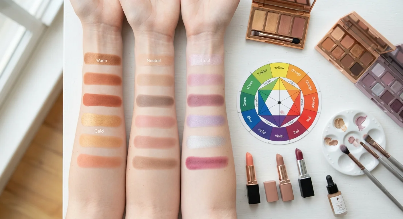
Why Undertones Matter More Than You Think
You've probably stood at a beauty counter, swatched a foundation that looked perfect in the bottle, then got it home only to find it looks oddly orange - or weirdly chalky. The culprit is almost always an undertone mismatch. Undertones are the secret logic behind why certain shades seem to disappear into your skin while others sit on top of it like a mask.
Understanding undertones doesn't require a cosmetology degree. It's a straightforward framework rooted in color theory - specifically, how pigments interact with the subtle hues in your skin. Once you grasp it, you'll shop smarter, waste less, and feel more confident about the products you already own. For a broader look at how color principles translate into everyday decisions, color theory basics for dressing offers a helpful parallel foundation.
3
Primary undertone categories used in makeup
Warm, cool, and neutral are the foundational categories used by makeup artists and cosmetic formulators to match products to skin.
~60%
Foundation returns attributed to shade mismatch
Industry estimates from beauty retailers suggest shade mismatch - often driven by undertone errors rather than depth errors - is the leading reason foundations are returned.
The Three Undertone Categories Explained
Every skin tone falls into one of three undertone families:
- Warm: Yellow, peachy, or golden hues beneath the surface. Common descriptors in product lines include 'W,' 'Golden,' or 'Peach.'
- Cool: Pink, red, or bluish hues. Product labels often use 'C,' 'Rose,' 'Pink,' or 'Porcelain.'
- Neutral: A balanced blend of warm and cool. Labels may say 'N,' 'Beige,' or 'Natural.'
These categories have nothing to do with how light or deep your complexion is. A fair-skinned person can have a warm undertone; a deep-skinned person can have a cool one. The full spectrum of undertones exists at every depth level - a detail that mainstream beauty marketing has historically overlooked but that skilled makeup artists have always accounted for.
How to Identify Your Undertone
A few reliable methods exist for pinpointing your undertone at home:
- The vein test: In natural daylight, look at the inside of your wrist. Blue-purple veins indicate cool; green veins indicate warm; blue-green veins suggest neutral.
- The jewelry test: Notice whether gold or silver jewelry tends to complement your skin more naturally. Gold flatters warm undertones; silver enhances cool ones; both work on neutral.
- The white paper test: Hold a piece of white paper next to your bare face. If your skin looks yellowish by comparison, you're likely warm. If it appears pinkish or rosy, you're probably cool. If it's hard to tell, you may be neutral.
None of these tests are infallible on their own, but together they'll give you a confident enough read to start making smarter product choices.
Test Swatches in Natural Light
Store lighting is designed to flatter products, not reveal undertone mismatches. Whenever possible, swatch foundation or concealer on your jawline and step outside or near a window before committing. The color you see in daylight is the color your skin will show in real life.
Applying Undertone Logic to Specific Products
Foundation: This is where undertone matters most. A warm-undertoned foundation on cool skin creates a ruddy or orange effect. A cool-toned formula on warm skin can look ashy. Match your foundation's undertone to yours first, then fine-tune the depth.
Blush: Warm undertones tend to look naturally flushed with peach, coral, and terracotta shades. Cool undertones glow with berry, rose, and mauve tones. Neutral undertones can often bridge both.
Eyeshadow: The stakes here are lower since eyeshadow doesn't need to match your skin - but undertone still shapes what feels harmonious. Earthy, bronzy, and amber tones complement warm undertones beautifully. Smoky, plummy, and silver-grey tones tend to flatter cool undertones. For technique guidance on getting the most from your shadow colors, the eyeshadow blending guide walks through the mechanics clearly.
If you're still building your kit from scratch, starting with makeup essentials helps you decide where to put your energy and budget first.
“The single biggest mistake people make when choosing foundation is focusing entirely on depth - light, medium, deep - and ignoring undertone entirely. That's why so many people go home with the wrong shade.”
— A professional makeup artist with over a decade of editorial experience, Licensed Makeup Artist, Beauty Educator
Beyond Makeup: Undertones Inform Your Whole Color Story
The same undertone logic that guides your makeup choices also translates to clothing and accessories. Warm undertones are often enhanced by olive, rust, camel, and mustard. Cool undertones tend to shine in navy, icy pink, emerald, and lavender. This extends naturally into building a signature color palette for your wardrobe - understanding your undertone makes those decisions much less guesswork and much more intentional.
Color theory in beauty is ultimately about harmony: getting products to work with your skin rather than against it. Once you know your undertone, you have a repeatable, reliable lens for evaluating any product - no more returning foundations or wondering why that blush looks different on you than it does in the tutorial.
This article is for informational and educational purposes only. Individual results may vary based on skin type, product formulation, and application technique.