
The Color Wheel: Your Invisible Style Tool
Every color relationship in fashion traces back to one surprisingly simple tool: the color wheel. Arranged in a circle, colors flow from warm (reds, oranges, yellows) to cool (blues, greens, purples), with relationships between them forming the logic behind why certain pairings feel instinctively right.
You don't need to memorize the wheel-you just need to know its three most useful pairings for everyday dressing.
- Complementary: Colors directly opposite each other on the wheel, like blue and orange or red and green. These create high-contrast, energetic looks.
- Analogous: Colors sitting side by side, like teal, blue, and navy. These feel cohesive and calm-excellent for polished, understated outfits.
- Triadic: Three colors evenly spaced around the wheel, like yellow, red, and blue. More advanced, but when balanced carefully, the result is playful and visually rich.
For a deeper dive into translating these principles into a repeatable wardrobe system, see outfit formulas that actually work.
62%
Consumers who cite color as top purchase factor
Research on consumer purchasing behavior consistently finds that color is among the leading reasons shoppers choose one clothing item over another.
90 sec
Time for first visual impression of color
Studies in color psychology suggest that people form initial visual impressions of a product or outfit within 90 seconds, with color playing a dominant role in that snap judgment.
Why Neutrals Make Everything Easier
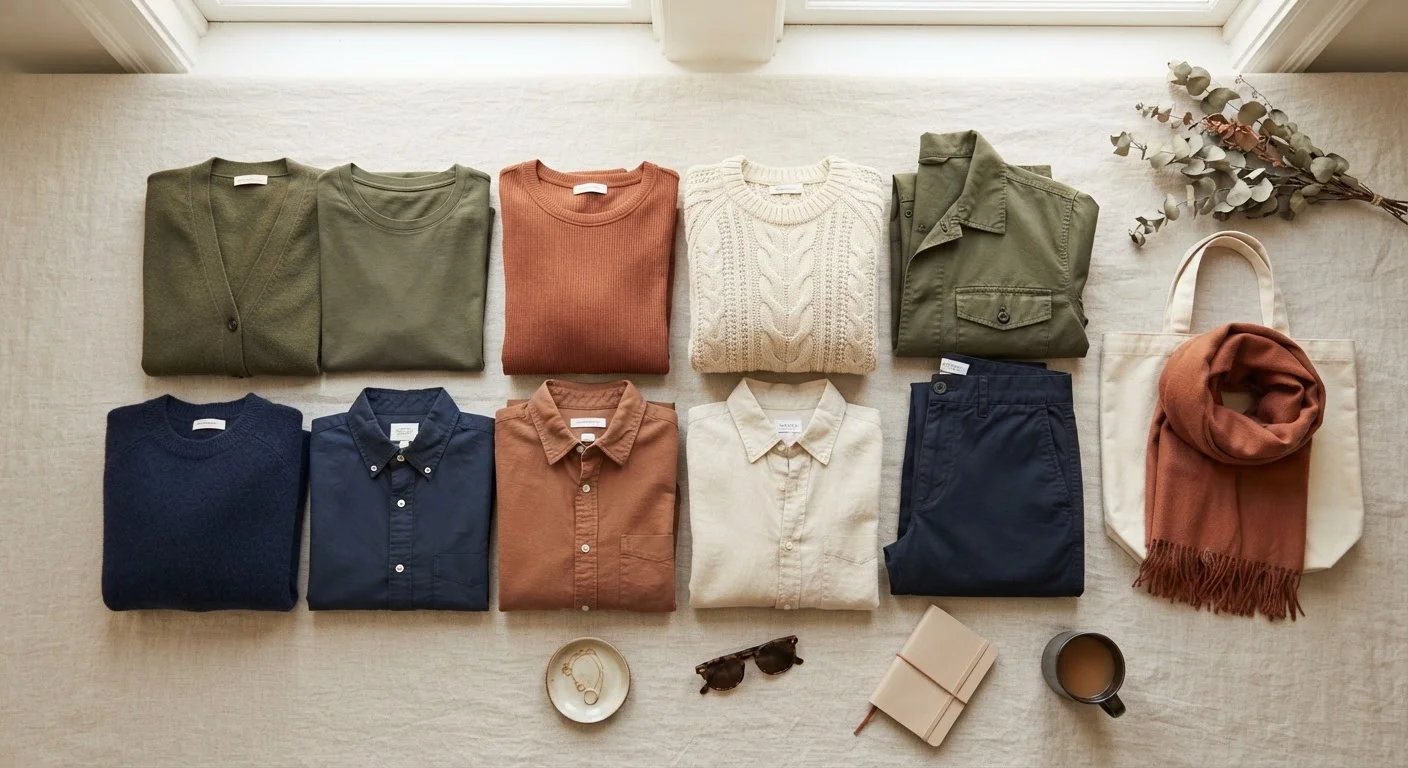
Neutrals-white, black, gray, navy, camel, and cream-sit largely outside the color wheel's intensity spectrum, which is exactly why they pair with almost anything. They act as visual anchors, giving bright or saturated colors room to breathe without competing.
A mustard yellow blouse that feels tricky to style immediately becomes approachable when worn with gray trousers. Olive green looks sharp next to cream. Burgundy settles into sophistication beside camel.
Start With a 'One Neutral, One Color' Rule
If color pairing still feels overwhelming, simplify your starting point: choose one neutral (white, black, gray, navy, or camel) and pair it with exactly one non-neutral color. This constraint removes decision fatigue and nearly always produces a clean, polished result. Once that feels natural, you can begin introducing a second accent color with more confidence.
This is also why a wardrobe built on a strong neutral base-with accent colors introduced deliberately-tends to feel cohesive and easy to navigate. If you're curious about building that foundation intentionally, building a signature color palette for your wardrobe walks through exactly that process.
Tonal Dressing and Contrast: Two Reliable Strategies
Beyond the color wheel, two practical strategies give you reliable results almost every time.
Tonal Dressing
Wearing different shades of the same color-light dusty blue with deeper cobalt, for example-creates an outfit that looks effortlessly put-together. The secret is varying texture or weight alongside tone, so the look has dimension rather than reading flat. A linen blouse in sage paired with a wool trouser in forest green? Quietly sophisticated.
Contrast Play
High contrast (dark + light) instantly sharpens an outfit and draws clear lines. Low contrast (similar tones throughout) feels relaxed and modern. Both work-what matters is making the choice deliberately rather than by default.
Color logic extends to accessories too. Pairing shoes with your outfit follows the same contrast and complement principles, making footwear a natural extension of your color decisions rather than an afterthought.
How to Start Applying This Today
Color theory works best when it serves you, not the other way around. A practical starting point: open your closet and identify the two or three neutrals you already own most of. Those are your anchors. Then look for one or two accent colors you're drawn to-pieces you reach for regularly.
From there, use the relationships above as a loose guide: pair your accent with its complement for a bold day, with an analogous neighbor for something softer, or layer it tonally when you want minimum effort and maximum polish.
For broader personal style guidance, the personal style tips hub is a great place to explore how color fits into a larger self-expression toolkit.
“Color is a power which directly influences the soul. It is an instrument that can be played upon.”
— Wassily Kandinsky, Painter and influential color theorist, author of 'Concerning the Spiritual in Art'